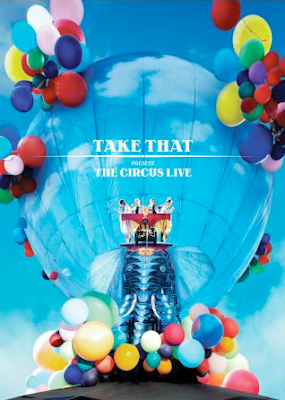
'Take That, The Circus' Poster
On the cover of the advert i would expect to see the artists name along with a picture of them. I would also want to see the name of the album and the tour name on the cover making it clear to be identified and selected by the public. These visuals will also give the audience an idea of what to expect, for example in the image above, a poster promoting the 'Take That The Circus' tour bright colours are used and as well as an elephant, a common circus animal with the band members riding it. The line which runs under the name 'Take That' also appears on the CD of the tours album which invokes continuity to the tour.
The overall image of the advert should be eye catching, unique, clean and, more importantly appeal to it's target market.
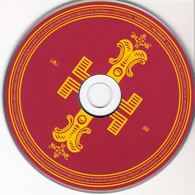
'Take That, The Circus' CD
On the cover i would expect to see much the same as the advert which, again will show continuity and help the public recognize that both media forms are for the same band/ group. Also both the CD cover and Poster use the same colour blue as the background and white font colour, again keeping the image of the band the same.
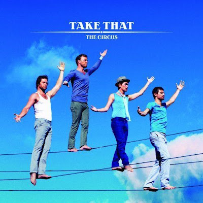
'Take That, The Circus' CD Cover
No response to “Reviewing Digipack - Take That, The Circus”
Leave a reply