Monday, 14 December 2009
feedback from 44
Your poster showing up during the vid was good too.
Feedback on Commentary from group 45
Commentary Feedback.
Feedback on Commentary
feedback on editing commentary
In our music video, we use many forms and conventions which stick to our genre of music. Many which follow the Goodwin’s points of analysis. In the lyrics, we hear, “she believes that she’s a bit old for gifts and cakes and party favors.” To link this with the video, we decided to have a party with other scenes that show she’s not having fun which is implied with this line. We also thought we would have seventeen candles on a cake which we put at the end of the video as the song is called seventeen candles and cake is mentioned in the lyric which is shown above. We are selling the artist by having him in the video alone so the audience are not distracted by anything. This way we are meeting the demands of the record label and can also involve lip syncing into it so we are covering two of the Goodwin’s points at once. The use of close ups of the artist help sell his look and make him a recognizable face.
The genre we have chosen is the indie rock genre and I feel that we kept within this genre well. We researched into other indie rock bands to see what we could do and looked into bands such as The Jonas Brothers. We liked how they dressed and used this in our own video by having Nathan dressed in a big black coat and jeans with converse style shoes. We also looked at the Kooks song, “When the Sun goes Down” which has many different shots of the band. We wanted to film our video in the same style as this video which is shown with the panning around the tree with the band member singing and having many close ups and over the shoulder shots. However, we did use transitions which don’t fit in with this genre as they don’t use transitions but we all thought they went well in the video.
Our location was to originally have it in a house but none of us could have it in our house so we changed it to a garden party. We had trouble shooting this so we had to quickly come up with a back up plan which was a location in the college. The use of having it in outside is so we could keep it in our genre and showing the artist in the location helped the audience to recognise the location. Our artist is represented as a casual cool artist in whom people can look up to as a role model as more of the audience will want to be like him, want to listen to his music therefore selling the artist in a positive way.
We have extras in the video for the party scenes so we could make this part work to a good standard. They are dressed casually implying that they do not care which a part of this genre so it fits in well and their expressions show they are having a good time which contrasts with the main female character.
We use voyeurism in our video as the female character doesn’t look up at the camera throughout the video whereas the male character does when he is singing the chorus. This shows the difference between the two characters. This way we take more focus upon the female as she is part of the story behind the song. We do not use much intertextuality apart from when we used the sin city effect. This is when we have the black and white with coloured balloons effect. We used this effect because when we were researching on it, it looked very effective and stood out a lot. We wanted our video to stand out and thought this was the perfect way to do this.
2. How effective is the combination of your main product and ancillary tasks?
I feel that we have a strong connection between the ancillary tasks and our music video. We thought it would be best to have them all linked by having the main characters on the ancillary tasks as we did in the music video. We went out and took pictures of the female and male instead of using shots from the video as they would come out better. We also thought it would be a good effect if we put it in black and white like the video as this would be a great link to the video. This way we can link the DVD cover with the video and sell the artist and song better.
There are also some genre characteristics shown on the DVD cover that link them to the artist which is shown with the text being highlighted pink, which links with the name of band, ‘The Pink Spiders.’ We chose to do this as we wanted to do something that stood out and it links in nicely with everything. We ere originally going to use another font which was being taught to us, again from YouTube, but we couldn’t understand where we were meant to be going with it so decided against this and stuck to a font we were good at from Photoshop.
The DVD cover promotes the record label in the way we have different record label company’s logos on the DVD to show they sponsor the band making them look better when the DVD sells. We also promote the band by having them actually on the DVD cover so it’s easily recognisable to the audience when they buy it. Also by having the girl on the back of the DVD cover, it offers an insight into what will be in the music video. This is trying to attract the audience into wanting to know more so having to buy the DVD to watch it.
3. What have you learnt from the audience feedback?
We have learnt a lot from the audience feedback, some we knew about already and some which were new. They mentioned we had repetitive footage when we had given in our rough cut. This was because we hadn’t enough footage so had to put some old parts in. We took this on board and later went out to film more footage, this time coming back with loads, and put it in where we had repeated parts. We also had large parts missing in the chorus when we were meant to film the band. We had trouble shooting this so had to improvise and shot a band member instead which worked even better than the band would off.
We had positive feedback about our sin city effect which was amazing for us as we had a lot of work to do still so this gave us motivation to carry on with the rest. It took us a long time to do which was another reason we were happy that people like it. We also got positive feedback for the final pieces which gave us a boost as were not very positive about our video but looking back, everything went really well and we are glad other people thought so too.
The people who gave us feedback on our tasks where from our target audience so this information we received from them was very important to us in improving the music video. This was because we want to attract the same age group and by them giving us feedback on what they liked and what they wanted to see was very crucial to making our music video a good one and one that would appeal to the target audience of teenagers.
Feedback on our pitch was good and bad as different people said different things. Some people were pleased with what we had planned to do and where we wished to head. They liked the idea of having party scenes in the video and said this worked well with the song. However, when we put pictures up of our shot types, people couldn’t see them clearly so suggested we should put new ones up which we did. They were also very praising about our ancillary tasks, saying that they followed the genre characteristics, it looked professional and the continuity was done well. This made us happy as we liked what we had done but were not sure other people would so when they said this, we were relieved.
4. How did you use new media technologies in the construction and research, planning and evaluation stages?
We researched into many different bands and artists in our indie rock genre and got a lot of information from it which helped us to put together our music video in a proper way. For this we used YouTube and Google to look into specific bands and artists to get the information we wanted and giving us much more than we needed. YouTube helped us through step by step to get our special sin city effect in our video in the right way. We had no idea how to do it originally but with some help, we managed to do a great job as this is an advanced piece of software which we didn’t get taught in class.
In our music video stage, we used Final Cut Express to piece our footage together, adding effects to it and generally getting it up to a high standard of a music video out today. We wanted to have special effects to change from one view to another so use dissolving and shifts to create these special features. We did this buy clicking on the part we wanted and choosing the right effect from the toolbar at the top. We went through each one and decided on the best effects for each change. We also had use of I Photo which meant that we could easily get our pictures up so we could get our magazine and DVD cover to the best we could. These programs have been easy to use and I have learnt much more than I knew before this task.
We kept a stage by stage blog explaining, keeping track and generally keeping information about what we were doing in each lesson and out side of lesson. This was good for us as if we didn’t know when or where we were filming then we could just check the blog and it would tell us. We uploaded pictures and our final pieces to show everyone else where we were heading to and how it turned out. People from other groups added feedback to it, giving us advice on to where we could improve which was very helpful to us and we learnt a lot from that.
I have progressed well from As to A2 as I have learnt many new techniques from this project and have grown in confidence in the practical side of things. Last year I was more on the blogging side and hardly did any practical work so decided this year I would do more practical so I have grown in confidence on this side this year. We have even gone further by using the sin city effect as this is a very hard technique to do.
When we did the pre-lim task, this prepared me for what to do this time round. It was a fun experience as I had not done anything like this in media before so it was quite new for me. Filming it was long process as we wanted to get it perfect in having different angles so we had to film it though about 5 times. When we went on to editing, this was easy to get it all on and together but it took a little longer getting it all squished in and in the right position. Overall though, it was fun and made me really want to do the real thing.
James' Evaluation
Our music video was made by using the song “Seventeen Candles” by The Pink Spiders.
In what ways does your media products use, develop or challenge forms and conventions of real media products?
My music video uses current forms of real media products. This is done through Goodwin’s six points. The genre characteristics are common of an indie band which is the genre of our band. The characteristics include their image which is clothing. In the video a large black jacket is seen on the singer, which is a trademark of The Kooks. This is also the case with the other characters in the other scenes of the video, who all display the typical clothing. This fits in with the image of them.
Feelings are always usually displayed within Indie genre songs, and this is also the case with “Seventeen Candles”. The character is seen singing the lyrics to the song, which creates more of a live performance, even though it isn’t. This adds to the true characteristics of an indie band, which is what we were trying to represent. This increases the bands image and they are represented as a classic indie band. This is because indie bands undertake many live performances. This then tells us that the singer is related strongly to the lyrics of the song and this helps to represent the meaning and story of the song.
The visuals in the video relate strongly to the song lyrics. For example the song is called “Seventeen Candles” and at the end of the sequence we see 17 candles on a cake being blown out, showing it is someone’s birthday. The lyrics suggest a party atmosphere which is reflected in the video to show this. There is no strong intertextuality to any other music video, but the indie genre is strongly reflected throughout the video. The location was outdoors in a simple garden setting which can be quite conventional amongst other music videos. The artist within the video relates to a party atmosphere would be very appealing as this is also an interest of the target audience age.
How effective is the combination of your main product and ancillary tasks?
The combination between the music video and DVD/Magazine cover is very strong. The atmosphere that is portrayed in the music video is reflected on the digipak. This is done by using the images of the two main characters. The use of the two characters helps set the mood of the song and also what it is about and also gives the audience an insight into what the video will contain. The DVD cover shows that one character is relatively happy, whereas the other shows signs of depression. It is also reflected using effects, for example black and white to show unhappiness and negativity. This helps to create a strong link between them and strengthens continuity. Increasing continuity is good as it helps the product increase promotion and also establishes an image for the song itself and the band. I think that the link between them help the audience get a strong feel for what the song/video is about, which is always a plus as the video can become more enjoyable and keep the viewer interested in the story. The continuity helps the band to be recognised if it was seen in more songs and this will boost promotionally reach. Adding the record label MTV to the front of the cover boost promotion and creates a larger package for the digipak.
The Mise-en-scène shown in the video is in keeping within the media products and does not have an unnecessary change of style, which would make the audience confused. For example within the video the party atmosphere is seen to be in an outside area, in a garden. The cover of the DVD also shows the outside and sticks with the same area of Mise-en-scène. This combination makes the overall look more effective and distinctive.
What have you learnt from audience feedback?
The feedback given has been helpful in the development of our project, as it as helped to indentify existing problems and also allows us to see the video, from effectively our audience. It is very helpful having feedback when we were still developing our idea and video as we can see if the audience see the same, as what we are aiming for. This is very helpful as it lets us know what parts we need to work on and which parts really appeal. It also lets us know if what were are doing makes sense and is not too confusing.
We could also refer back to the audience feedback at later stages in the development to resurrect ideas and put them into practice, if there was a positive general consensus.
Our initial pitch showed a different location, which the audience thought was very good, however it was not possible to undertake this idea as achieving it would be very difficult and complex and weather conditions would need to have been perfect.
When our rough cut was shown to the audience it was obvious that some scenes were too repetitive, and we agreed. After the rough cut deadline we adjusted this by filming more footage and capturing the lip syncing scenes. This made the video more varied and interesting.
From the digipak the feedback given was mostly positive, but we learned that some information wasn’t included, i.e. a band website. Also we chose to use greyscale on the DVD cover only as it creates an atmosphere amongst the characters. We learnt that the continuity overall was very good, as it used similar photos, same style font and colouring.
Using Blogger made it very easy for us to revert back to our feedback that had been given, and by using the feedback we have been able to enhance our video and adjust it to the eye of the viewer and how they would like to see it, which is what we were primarily aiming for.
From viewing the feedback from our final video, I would make changes for next time, including a live band, with performance related scenes, which would give a stronger atmosphere, as it would link into the party scene.
How did you use new media technologies in the construction and research planning and evaluation stages?
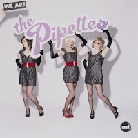
From the beginning of our product we began using media technologies to help research our project. Our primary source was YouTube. We used this website to analyse other videos using the same theme, this was done to help us with ideas for our video. We looked firstly at The Pipettes as they were a band of the same genre, and YouTube allowed us to search many videos of theirs to get a general feel, which was very useful.
Once we had captured footage for our video we then uploaded it to Final Cut Express HD. This program allowed us to cut and move select footage, add many effects such as transitions, colour adjustment and other specialist effects. It also allowed us to add the song to the video and edit the video as far as possible to achieve our finished product, which is made into a QuickTime.
We designed our digipak in Photoshop. This was used as it allowed us to make a very comprehensive image with specialist tools to change the look of the image. We used effects to help make the image eye catching and attractive. However when using this program we were sometimes unsure on how to complete a certain tasks. So we used YouTube to locate a tutorial on how to do this. This was very successful and enabled us to go on with our project as we planned it.
The main new media technology that we used was Blogger. This online website blog allowed us to keep all of our plans, ideas, updates, completed tasks, photos, videos and comments on one simple page. It was very useful as it held all of our feedback and also made it ease for the audience to find our information. Our final media technology we used was the video commentary. This was done by using a video camera to record a commentary from the group on select questions, the use of the video meant a new way in which to make a commentary that was more interesting and fun to watch. This shows how the modern age is taking over and changing the way in which things can be done.
Wednesday, 9 December 2009
Feedback on Commentary
Sunday, 6 December 2009
Nathan's Write Up
If we were the Pink Spiders, we certainly would have sold the lead singer of the band as an artist. All of the performance elements of the piece are the lead singer of the band singing. To the audience, they would have total exposure to the lead singer, selling him completely. Also our video creates a lot of voyeurism for the audience. If it’s not the lead singer being shown on screen, it’s a girl (Emily), that fits into our narrative structure of the piece. We watch her throughout the video without her knowing, where the lead singer acknowledges the audience’s presents by singing directly to the camera. These are 2 of Goodwin’s points we made sure we included.
Unfortunately there is no way of linking music and visuals for we didn’t have means available to us in the time we had left. We had planned on it though.
Our combination of our main product and ancillary texts is very effective together. The two pieces work together with great style and continuity. They both feature black and white images and shots along with the artist spread across all three pieces. Both the DVD cover and the magazine advert have the same text styles, and the same logos to promote the video it’s self.
The black and white styling’s of the DVD cover, I believe, keeps with the indie look we have in the video, helping promote the genre and hopefully audiences with that taste in music looking for an eye catching buy. I also think the text styles of the piece and their colours also help identify a genre for it, with most indie related products having bright colours in their style. The bright colours would also be quite eye catching from a marketing point of view.
All three pieces of our project feature the artist, this helps to sell the artist in a successful manner. The pictures taken for the ancillary tasks for the artist were shot in a professional way and the look of the artist is continued throughout.
The feedback we received about all our products was very helpful. First of all, the feedback we received about our roughcut video stated it was too repetitive and it was missing large sections. We were able to take this information and use it to improve our final piece. We received mix reviews concerning our ancillary texts. Many said it looked profession and we had used continuity well. This, of course, is what we were trying to achieve with all products. We did also receive some constructive criticism about the products, including the noticing some out of sync singing in our main music video. There was also a problem with an effect we’d used, that at one point hadn’t been integrated properly with the footage from the video, causing it to look rather messy.
As for the text products, there was some mention of a spelling mistake we hadn’t noticed on the DVD cover. Unfortunately it was too late to change any of these points raised by our peers. But I believe it has taught us, that in the future we should always check our work carefully before submitting it.
The music video we made was constructed with the PC/Mac software Final Cut Express. We used Final Cut all the way through our creation of the music video to splice together the footage we’d shot on a digital camcorder and edit that footage into the way we wanted. We also used Final Cut Express to create effects for the video, to help it look better. One effect we wanted was turning some balloons, that were in the video, against the rest of the footage that was black and white. We were unsure how to achieve this, so we looked towards the website ‘Youtube’ for a guide to teach us how to do so. This helped our cause greatly and improved the look of the video.
To created the ancillary texts we used the software Photoshop. The templates had been pre-made for us, but it was our job to fill them. We took some photos we took from a digital camera and edited them here. As well as that we were able to try out different fonts for the texts and also import images saved from the internet to there.
During the planning stages of the project we typed it all up onto our internet blog, here we were able to note down locations for filming as well as a props list and even upload pictures of our shot-list onto there. We saved pictures we found from Google and placed them on the blog to, to help us envision what we wanted to create.
When it came to the evaluation stages, we were asked to make a video commentary. It was of our group talking about how we created the music video. We also edited that video on Final Cut Express and uploaded it to our blog, along with all our other finished products.
Evaluation Of Music Video
Evaluation Of Music Video
In what ways does your media product use, develop or challenge forms and conventions of real media products?
My music video does demonstrate the songs genre characteristics. For example the male character performs and lips-syncs to the song, which is the case in most indie bands music videos. There is also a narrative to the video about the relationship between the male and female looking at how they find out they their true feelings for each other, which, again follows the indie genre theme.
The video also shows conventional genre camerawork, editing and mise-en-scene. In the music video for the song ‘When the sun goes down’ by the ‘Arctic Monkeys,’ another indie band, they use medium and close up camera shot types at a level angle looking at the subject against a plain background. (1).

The same type of shots can be seen in my video when the party scenes are taking place as well as when the male character is lip-syncing. I used simple cuts to change between a shot, which goes with convention; I also used transition effects to the video, which goes against the genre convention, as they aren’t often used.
The video develops and conforms to ‘Andrew Goodwins’ theory of video forms. His points are as follows: Does the music video demonstrate the genre characteristics? Are there any relationships between the lyrics and visuals? Are there any relationships between the music and visuals? What are the demands of the record label? Are there any reference to/of voyeurisms? And are there any intertextuality references?
I feel that there are quite a few relationships between the lyrics and visuals of the song. An example of this is that there are seventeen candles on the birthday cake at the end of video, the name of the song is ‘Seventeen Candles’ and this is a also a lyric in the chorus. Another example of this relationship is that when the male singer says about the female in the video it cuts to her and shows her reaction to what has just been said.
However I feel that the strongest relationships are between the music and visuals. The main of which is that the male character sings to the lyrics of the chorus throughout the song, also the song matches what is being seen. For example when the lyrics say about ‘party favours’ a parts scene is shown.
There are many references to the notion of voyeurism, as the female character doesn’t look at the camera throughout the song. The effect that this has is the female character is made to be the protagonist as she is unaware that the audience are looking at her. The male character follows the same suit apart from one chorus when he follows the camera as it pans/ tracks around him. The effect that this has is the audience become more involved and take the role of the female.
There are no purposely placed intertexual references about what to film in the video, as I wanted it to be unique and new. The only reference to another film or music video is the technique from ‘Sin City’ where they have a greyscale background with only important areas in colour.
The demands of the record label can be clearly seen in the video. One of these demands is to make the artist a tool of promotion. An example of this is that there are areas of the video when the male character, who is the artist, is on his own. This means that the audience’s full attention is on that character which will allow them to notice him.
There were many challenges that my group and I faced over the months that this project took to finish which I feel that we overcame well. The worst was that on the days we had planned on filming outside it rained throughout the day and because it started to get darker earlier we had less time to film as each day passed. Because of this we had to change the location of some scenes almost instantly and had to think about how we were going to get props to the new location. An example of this is that on the day we wanted to film one of the party scenes outside, it rained. Meaning that we had to film indoors, the effect that this had on the scene was that it didn’t have the same look as we had planned on and as a result took a smaller part than planned in the final video.
How effective is the combination of your ma
in product and ancillary tasks?
I feel that the relationship and continuity between the three media forms: the music video, magazine advert and the DVD cover are very strong. The main reasons for this is that I have used the same style and image as has been used to produce/ compose them. An example of this is that the same image, a picture of the male character has been used as the background on the DVD cover and magazine advert. In add
ition to this I have also used the same style of font at the same size and in the same colour that, again links the three products together. This is important when trying to advertise or sell the artist, as the viewer needs to be able to see the same style of work at a glace among other artists in a shop or on a music channel like MTV. There are also relationships between the video and the advertising products; these are shown through the same style of images on the DVD cover and the magazine advert as there are in parts of the video. Another major link between the video and DVD cover is that ha
ving the female character on the back of the cover allows the audience/ buyer an insight as to what to expect when watching it. There are also some genre characteristics shown on the DVD cover and magazine that link them to the genre, artist and the music video. For instance the text on the DVD cover are highlighted pink, which connect that with the name of band, ‘The Pink Spiders.’
Some of the buyers may also follow a certain celebrity or like the views of a particular magazine and television channel. This allows me to use this as a marketing point, I have placed three quotes on the magazine advert from: ‘NME’, a TV music channel and online media centre, ‘Q’ another music channel and online medium
and ‘play.com’ an online shop. Having these quotes means that the audience/ buyer may think that if these people/ shops/ music channels think that it is a good song then I will buy it. Also if the quote is from a radio or TV channel they will likely play the song or video and so the viewer would be able to see it before they buy it.
Also because there are both a female and male on the DVD cover it appeals to both male and female buyers, again promoting the artist as the product will not be fixed to when it can be advertised. For example a toy or product that has been designed for a boy would be advertised during a programme or among other toys that are for the same gender and/ or age range.

What have you learnt from the audience feedback?
After my peers had viewed the video along with the magazine advert and DVD cover they wrote their views on my groups blog. However because my class is not the target market for the video, young teenagers aged 13 – 16 their views may be different. From the feedback I learnt that they thought that the video did follow the genre conventions and that the seventeen candles on the cake at the end was a good idea, as they like how ‘it added to the party elements which the song exploits, and explores’ (2). They also felt that there was a strong relationship between the visuals and the music, although they felt that the demands of the record label to be improved by having more variety of shot types especially close up’s of the artist as this would help see them.
I also learnt that the audience thought that the DVD cover looked very professional and that they really like the layout as they felt that it was ‘unique.’ (3). They also felt that the continuity between the different media forms was successful and worked well as well as it containing all the necessary information and features. However, they did feel that the text between the DVD cover and the magazine advert did not match which prevented the continuity continuing between them.
Apart from that drawback I learnt that the target audience felt that the magazine advert portrays the artist positively through having the focus him solely as a clean and new background image. They also liked the quotes and ratings from various important music industry professional advertising, critics and television music channels or magazines. To add to this they also liked the information on where to get and download the video/ song that said ‘available on iTunes now’
After the roughcut feedback, again by my peers, it was clear that there were areas of the project needed to be resolved. The biggest of which was that we were missing a lot of footage, especially for the chorus, which we were going to have a performance and lip-syncing by the male character. Also it was picked up on that some of the footage was repeated which meant that we, again had to film more to fill the gaps where repeated scenes had been.
How did you use new media technologies in the construction and research, planning and evaluation stages?
In the research stages the main new technology which I used was the Internet and the website ‘Youtube.’ I used this to view other indie bands music videos, which allowed me to see how professional directors used the genre conventions, which camera angles/ shots were used and how these portrayed the artist. At this stage I also used ‘Google’ as it gave me a worldwide search into each point, giving me a greater variety of information from which to continue my research.
In the construction stages I used ‘Final cut express’ to edit my imported video which I filmed using a video camera and tripod. The advantages of using this software are that it is easy to operate, view you product as well as adding video effects, transitions and if desired, text. Also using this makes it easy to convert and upload onto the blog, which I used throughout the whole process, especially the planning stages by documenting my progress, decisions made and responses/ reactions to theses decisions. The blog allowed my group and I to stay in contact with each other outside of lesson times which mean that we could plan when we were going to film etc as well as writing the meet times down and where to meet so we didn’t forget. I also used ‘iPhoto’ to import the images that I inserted on the DVD cover and magazine advert. I chose this software because it is very quick to upload the photographs and easy to add them to ‘Photoshop’ which I used to edit and create the Digipack.
In the evaluation stages I again used the blog to view what my audience and peers said about my video, DVD cover and magazine advert. From this I could then use ‘Microsoft Word’ to write the evaluation containing quotes and information from what had been written.
I feel that since I started Media Studies at Long Road I have improved a great deal in every aspect of filming, editing and producing various media products. From the very first prelim task I undertook in my AS year to the final music video project in A2 I believe that I have developed a good understanding of how to use a variety of different camera angles/ shots, different editing techniques as well as how to manipulate images in Photoshop and the different look/ atmosphere each of these can have on the finished product.
(1) Youtube, The Arctic Monkeys when the sun goes down video-(http://www.youtube.com/watch?v=2W_hEdt1Xes&feature=related)
(2) And (3) Blogger, group 43 blog - (http://43musicvideo09.blogspot.com/)
Screen shots of The Arctic Monkeys when the sun goes down video from Youtube (same URL as the video)
Images of my DVD advert and Magazine advert from Blogger (same URL)
Monday, 30 November 2009
Digipack Feedback from Group 45
Group 48 Feedback on Digipack
This album cover is very professional, the entire layout gives a unique appearance. Obviously there are several mistakes, such as spelling. For example; DVD Authoring Cover design done by Nugget and Rob Productions ffrom T2 44 Project for A2 Media project.
Overall, its brilliant. We especially liked the use of the piano up the spine of the album cover.
Magazine Advert
We feel the magazine advert doesn't compare to the album cover. It would've been more apealling if less information was given. However, the colour scheme is effective and the final product is good.
Feedback from 44
Your artist is promoted well, shown on the front of the DVD and on the magazine cover.
There is continuity but the font styles used do not match. You also spelt commentary incorrectly, you have spelt it without the A resulting it being defined as a commune in the department of Allier in central France. We recognise you were not trying to intend your meaning for this but overall your work is well constructed and gives a good insight into what to expect from your music video.
feedback
Promotes artist well, as it has a picture of them on front and back.
The poster is not in black and white which doesn't run with the DVD, or the font is different colours.
The poster doesn't have band website or info like that.
The writing on the front looks a bit muddled.
Continuity good as they have both 2 people in all three things.
Group 48 digi-pack feedback
Monday, 23 November 2009
lesson Update
Thursday, 19 November 2009
David Bowie DVD Cover
 see the artist displayed on the front of the case. In this example David Bowie is on the front, though his face has been made up by lots of different pictures of his face.
These are dived into two discs which is easily shown on the back so you know which disc to go to when you want to listen to a certain track. The presentation of this is kept simple for the fans so they can scan for the chosen track in an easy manner.see which of his songs the DVD contains.


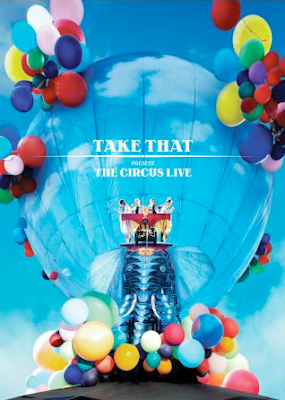
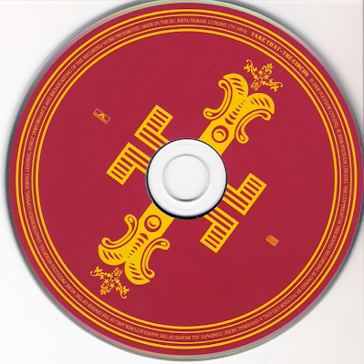
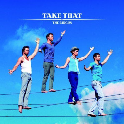
Reviewing Digipack - Take That, The Circus
Wednesday, 18 November 2009
Feedback from group 45
Well done :)
Group 45
Feedback from T2-47.
- Genre Conventions: Indie Rock genre, clothing matched genre, there was a lead singer. Lip Sync was out at one point. Main story along side that cuts away to, although the story isn't too clear.
- Lyrics & Visuals: 17 Candles on the cake link to their lyrics.
- Music & visuals: No instruments but had someone to lip sync.
- Demands of the record labels: Main artist had lots of shots throughout along side the main story.
- Voyeurism: Yes, when they're partying with balloons, whens at the tree & when shes texting because you can see her texts.
- Intertextual reference: No real intertextual reference to any other music video, film or tv program.
Group 48 feedback on final cut
Within the lyrics and visuals the cake and balloons add to the party elements which is what the song exploits, and explores.
Within the visuals the partying and the down beat amplify the relationship between visuals and the music.
The demands of the record label are to emphasise the artists, this could be achieved better by having more close-ups of the artists to build the recognition of the band.
The reference of notion to looking is very strong in this video, many of the shots are directed at the artists as the watch the lens.
The intertextual is interlinked with modern teenage TV dramas such as skins or waterloo road. The troubled relationships and narrative are similar in these.
Monday, 9 November 2009
Lesson Update
Thursday, 5 November 2009
Review of last years music video - Group P2-38 'Lotus'
- holding a steady shot
- framing your shots
- variety of shot distance
- shooting appropriate material
- selecting mise-en-scene
- appropriate set/ locations
- using varied shot transitions
- using sound with images
Additional filming
Wednesday, 4 November 2009
Feedback Feedback
Monday, 2 November 2009
Roughcut Feedback
You need to add some lip syncing and possibly some more close up shots to show the girls emotion even more and make the video more personal.
We really like the ending of the video with the candles on the cake, the editing here is effective but there is room for improvement. We also think that you should use more footage that is lit just with candles as this gives a softer atmosphere to the video.
Well done so far :)
Feedback from 44
Group 48 feedback on roughcut
Thursday, 22 October 2009
Review Of Roughcut
- lip syncing
- the band playing (performance)
- various editing transitions
Roughcut
Wednesday, 21 October 2009
Location


....Editing continued
Editing....
Monday, 12 October 2009
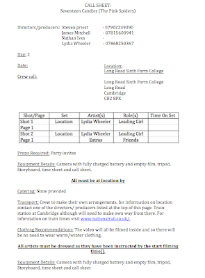
Call Sheet For Day 2
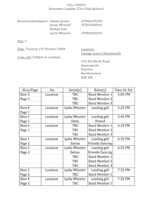
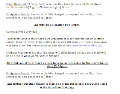
Call Sheet For Day 1
Thursday, 8 October 2009
Lyrics to our chosen song
Below are the lryics for our chosen song, the pink spiders 'seventeen candles' which we will need to learn before filming our music video.
Every day’s a distraction
All the animals just looking for action
And Emily’s free-styling rhymes
Smoking in the girl’s room to kill some time
Cause all they want is a girl who
Parties hard and doesn’t bother to argue
And nobody’s worse for the wear
Everybody’s cool with the “I don’t care”

Seventeen candles are burning bright tonight
But I’ve a feeling
That she believes she’s a bit old for cake
And gifts and party favours
Emily, everyone told her it don’t get much better
Which only upset her
Could this be as good as it gets?

Just as loud as a half-stack
Of vodka tonic bottled up in her backpack
She’s badder than big heavy Jane’s
She turns it all out but the fact remains
That all we do is talk about the future
Like there’s some way to control it
Why not just enjoy the ride?

Seventeen candles are burning bright tonight
But I’ve a feeling
That she believes she’s a bit old for cake
And gifts and party favours
Emily, everyone told her it don’t get much better
Which only upset her
Could this be as good as it gets?

She said if this is the nightlife I’d rather stay in
You call this a good time I just call it a trip
If this is as good as it gets
Then I’m packing up my shit and I’m gone

Seventeen candles are burning bright tonight
But I’ve a feeling
That she believes she’s a bit old for cake
And gifts and party favours
Emily, everyone told her it don’t get much better
Which only upset her
Could this be as good as it gets?

Seventeen candles are burning bright tonight
But I’ve a feeling
That she believes she’s a bit old for cake
And gifts and party favours
Emily, everyone told her it don’t get much better
Which only upset her
Could this be as good as it gets?
Response..to..feedback.
- retake the photo of the storyboard, time sheet and annotation to story board making sure that they are of better quality and in a higher resolution which will make it easier to read and understand
Feedback from t2-44
It would've been nice to have a call sheet.
We can't seem to maximise the storyboard picture so if you could upload a higher resolution version it would be easier and more informative to see. The pictures though easily shows the idea of the music video in a clear format nonetheless, reading the writing is not possible.
Well structured timeline, the only readable words are BLACK + WHITE so need to fix that!
A LOT of good background work so keep it up!
feedback from group 45
We are group 45 and we have just looked at your blogtiiing it looks great, however we have found a few areas that could be improved upon.
To begin with we found that the colour scheme was great and great for attracting the viewer, many images were used which also kept us intrested. we liked th use of colours and images that have been used.
The storyboard looks quite detailed but lacks enthusiasm as not much detailed was involved
laterz geezas
Feedback Group T2-47
- Well planned, lots of information on planning for the day of filming; Times, Props, Locations.
- Well thought out linking the video with the song title '17 Candles' with the girl being 17 and 17 candles on the cake, with band playing.
- Good research. Eg. Target market/Certificate, researching what makes it rated 12.
Hello!!!
We really like your ideas and blog it is nice and bright and very colourful PICTURES ARE GOOD :)
You also have lots of planning
We don't really have any critism for you SORRY lolzzzzz
LOVE from Sheridan, Hannah, Dan and Cassie :) xxxxx
Wednesday, 7 October 2009
Music Video Analysis

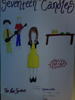
Digipack - magazine rough idea
Filming time amendments
- no need for a tent
- will need a large table
- space for the band to play
- dance space
- lights
Monday, 5 October 2009
filming Times
Props
- cake with seventeen candles
- fairy lights
- table
- food and drink
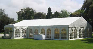
- marque
- instrument (2 guitars, bass)
- flood lights
- guests


Location
