Monday 30 November 2009
Digipack Feedback from Group 45
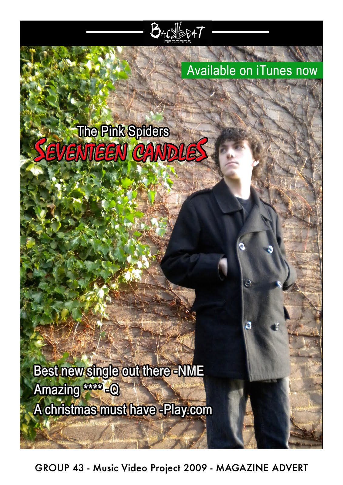
Both your magazine advert and DVD cover are very successful. There is continuity between both and the music video. The advertisements are effect with the quote 'A christmas must have' which really pushes the DVD promotion. The contrast between the black and white images on the DVD cover and the pink writing is very eye catching and the shot of the lead singer looks very professional on the magazine advert :) well done!
Group 48 Feedback on Digipack
DVD Album Cover
This album cover is very professional, the entire layout gives a unique appearance. Obviously there are several mistakes, such as spelling. For example; DVD Authoring Cover design done by Nugget and Rob Productions ffrom T2 44 Project for A2 Media project.
Overall, its brilliant. We especially liked the use of the piano up the spine of the album cover.
Magazine Advert
We feel the magazine advert doesn't compare to the album cover. It would've been more apealling if less information was given. However, the colour scheme is effective and the final product is good.
Feedback from 44
Your DVD Cover is good. It includes all the necessary features for a DVD Cover, the magazine advert is nicely done too, with continuity between the use of the same shot for the front of the DVD.
Your artist is promoted well, shown on the front of the DVD and on the magazine cover.
There is continuity but the font styles used do not match. You also spelt commentary incorrectly, you have spelt it without the A resulting it being defined as a commune in the department of Allier in central France. We recognise you were not trying to intend your meaning for this but overall your work is well constructed and gives a good insight into what to expect from your music video.
feedback
Has all that it should have on it.
Promotes artist well, as it has a picture of them on front and back.
The poster is not in black and white which doesn't run with the DVD, or the font is different colours.
The poster doesn't have band website or info like that.
The writing on the front looks a bit muddled.
Continuity good as they have both 2 people in all three things.
Group 48 digi-pack feedback
Your digi-pack definitely follows the same characteristics from your video. The continuity can't be argued with. The advert looks professional with a good shot of your lead singer, and the inclusion of ratings and availability on i`tunes is a good touch also. The DVD cover also carries good continuity and portraits the artist positively. All in all in good digi-pack.

Wednesday 25 November 2009
Magazine Advert
Monday 23 November 2009
lesson Update
In todays lesson we started work on our digipack. We chose to have a picture of the person who is singing in the video as the background for our magazine advert.
Thursday 19 November 2009
David Bowie DVD Cover
On a dvd cover, i would expect to see the artist displayed on the front of the case. In this example David Bowie is on the front, though his face has been made up by lots of different pictures of his face.

These are dived into two discs which is easily shown on the back so you know which disc to go to when you want to listen to a certain track. The presentation of this is kept simple for the fans so they can scan for the chosen track in an easy manner.see which of his songs the DVD contains.

see the artist displayed on the front of the case. In this example David Bowie is on the front, though his face has been made up by lots of different pictures of his face. The title of the dvd is in white big bold letters which stand out against the blue background. This is effective in the way that he wants people to notice the dvd so they would then go on to buying it.
On the back of the DVD case has all the tracks
that the DVD contains. This obviously would appeal to any David Bowie fan by letting them
These are dived into two discs which is easily shown on the back so you know which disc to go to when you want to listen to a certain track. The presentation of this is kept simple for the fans so they can scan for the chosen track in an easy manner.see which of his songs the DVD contains.
Inside the dvd cover, there are two different sides, one holding the dvds which is normally on the right side and the other side, it holds the booklet of information about the dvd.
Within the DVD case, the booklet holds information on the artist and their tracks. This information normally consists of the song title, music publisher, director and sometimes the lyrics to the songs.
Reviewing Digipack - Take That, The Circus
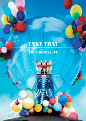
'Take That, The Circus' Poster
On the cover of the advert i would expect to see the artists name along with a picture of them. I would also want to see the name of the album and the tour name on the cover making it clear to be identified and selected by the public. These visuals will also give the audience an idea of what to expect, for example in the image above, a poster promoting the 'Take That The Circus' tour bright colours are used and as well as an elephant, a common circus animal with the band members riding it. The line which runs under the name 'Take That' also appears on the CD of the tours album which invokes continuity to the tour.
The overall image of the advert should be eye catching, unique, clean and, more importantly appeal to it's target market.
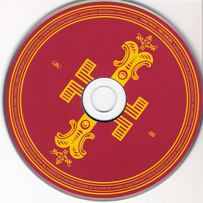
'Take That, The Circus' CD
On the cover i would expect to see much the same as the advert which, again will show continuity and help the public recognize that both media forms are for the same band/ group. Also both the CD cover and Poster use the same colour blue as the background and white font colour, again keeping the image of the band the same.
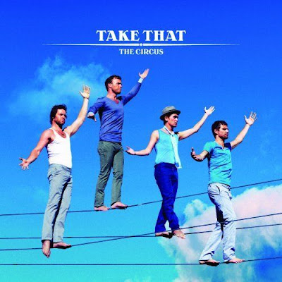
'Take That, The Circus' CD Cover
Wednesday 18 November 2009
Feedback from group 45
This video tells a story therefore the lyrics have a strong relationship with the visuals. It fits in with the genre conventions and sells the artist. Although there are limited shot types, there are some variations featuring the artist. The colour scheme is effective (the black and white representing the females mood) picturing the single Red balloon. When the mood is lifted the video transforms to colour. On the other hand the lip-syncing at begins a little trembly and it is hard to establish whether the artist is actually saying the words however, it does improve towards the end but, the artist looks dis-interested. Furthermore the shot that films the female by the tree and going around the tree is repeated a little too often. The video would benefit from having more vaired shots in place of this repeated footage.
Well done :)
Group 45
Well done :)
Group 45
Feedback from T2-47.
- Genre Conventions: Indie Rock genre, clothing matched genre, there was a lead singer. Lip Sync was out at one point. Main story along side that cuts away to, although the story isn't too clear.
- Lyrics & Visuals: 17 Candles on the cake link to their lyrics.
- Music & visuals: No instruments but had someone to lip sync.
- Demands of the record labels: Main artist had lots of shots throughout along side the main story.
- Voyeurism: Yes, when they're partying with balloons, whens at the tree & when shes texting because you can see her texts.
- Intertextual reference: No real intertextual reference to any other music video, film or tv program.
Group 48 feedback on final cut
This video is of a rock/pop genre and it does show us some of the typical genre characteristics such as: use of a narrative and advertising the artist but it does miss out other conventions such as showing the band and no performance element.
Within the lyrics and visuals the cake and balloons add to the party elements which is what the song exploits, and explores.
Within the visuals the partying and the down beat amplify the relationship between visuals and the music.
The demands of the record label are to emphasise the artists, this could be achieved better by having more close-ups of the artists to build the recognition of the band.
The reference of notion to looking is very strong in this video, many of the shots are directed at the artists as the watch the lens.
The intertextual is interlinked with modern teenage TV dramas such as skins or waterloo road. The troubled relationships and narrative are similar in these.
Monday 9 November 2009
Lesson Update
In todays lesson we edited our video further: Firstly we finished gray-scaling the remaining parts of our video. We also began to add video transitions throughout our footage.
For next lesson we plan to capture the last shots, which are the band performing the chorus at the party.
We will also start to design and produce our digipack which involves making a poster with tour dates and information on the band and DVD cover with track names, where it was filmed and on which tour as well as design for DVD image.
Thursday 5 November 2009
Review of last years music video - Group P2-38 'Lotus'
We feel that what makes the video effective and memorable are the low lighting conditions at
the start of the video and when the band performs. This is because using technique hides the
identify of the band which makes the viewer want to see the rest of the video to see what the
band members look like. They also use a technique of back lighting which again creates the
same response.
This video meets the criteria by demonstrating excellence in the following areas:
- holding a steady shot
- framing your shots
- variety of shot distance
- shooting appropriate material
- selecting mise-en-scene
- appropriate set/ locations
- using varied shot transitions
- using sound with images
how does it address goodwins points?
From this video we have seen how variety and the amount of shots can improve a video and
make it more interesting. We have also seen how lighting has a big effect on the overall
atmosphere of the video. We also learnt that using a lower camera angle improves the videos
image as it changes the shot variety and earns points on the advanced criteria. Because of this
will be looking into using different camera angles among other techniques which are displayed
in this video.
Additional filming
After we submitted our roughcut it was clear that there were some large portions of footage missing. We plan to fill most of these gaps with the band singing and performing the chorus of the song. We will also include more shot variety (close ups, long shots etc) as up to now we have only really been using medium shots.
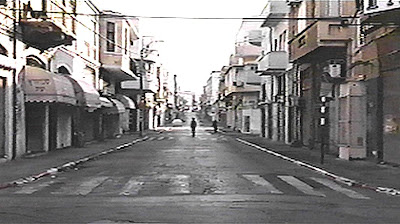
Extreme Close Up:
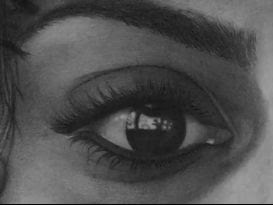
Close Up:
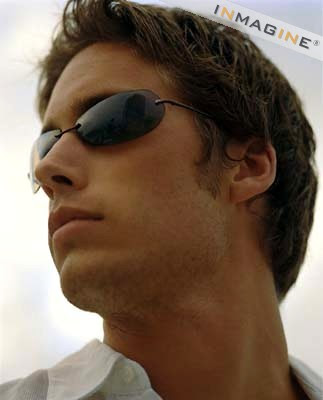
Long Shot:
Wednesday 4 November 2009
Feedback Feedback
We read through the feedback we were given by other groups in our class and have taken it all into consideration. We realized we still need to fill a large section of our work in which we thought lip syncing was the best way to fill this. This way we also stick to the Goodwin's points.
We had positive feedback about the different colour filters which was good as we were most proud about this and it took us a long time to do.
We decided to film some close ups of the female as we haven't got any yet so thought this would be a good idea to include some. This gives it a variety which was mentioned in a feedback from group 48.
Also filming different shots we will be able to replace the scenes which are repeated in the video which some groups did pick up on.
The lip syncing will be demonstrated by the band playing the chorus which we also still need to film.
Monday 2 November 2009
Roughcut Feedback
We can see that you still have a lot to do and more footage to film but the footage you have is really effective. The parts where you have the girl in black and white with the balloons in colour reflects her emotions and fits in well with the narrative. The camerawork here is also very good. There are a good range of shots that vary throughout the footage to keep the viewers interest.
You need to add some lip syncing and possibly some more close up shots to show the girls emotion even more and make the video more personal.
We really like the ending of the video with the candles on the cake, the editing here is effective but there is room for improvement. We also think that you should use more footage that is lit just with candles as this gives a softer atmosphere to the video.
Well done so far :)
Feedback from 44
Your party shots do represent the genre well, the idea of grey scaled shots to show a disappointed female works well too to give off that effect. The obvious is that you are missing a large portion of your overall music video where the band will be performing. The chromekey filter is a really cool feature to pick out the colour of the balloons against the grayscale for the shot.
it cool, need to fill the gaps in, fits with goodwin. though have not yet seen any lip syncing, fits the genre, good auteur theory, doesnt sell the artist, goes with blog, advanced editing done well, good job.
Group 48 feedback on roughcut
You had some good ideas for this. Obviously there is a lot of footage missing and you miss out on a lot of variety here, you could maybe have some lip syncing in these areas. To be honest just overall more variety to add to the video to make it more aesthetically pleasing, we did also notice the same shots being repeated maybe this could be edited too. But maybe when more footage is added in it will be less recognizable. So overall, more shots, more camera variety to make, and more need to sell the artist.